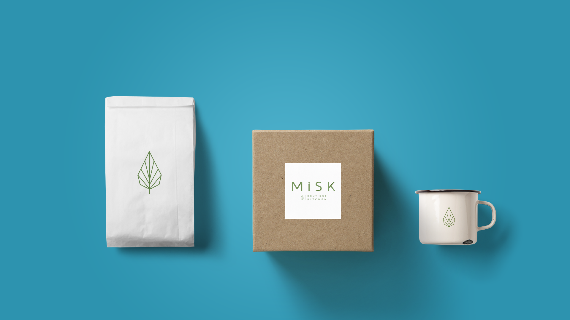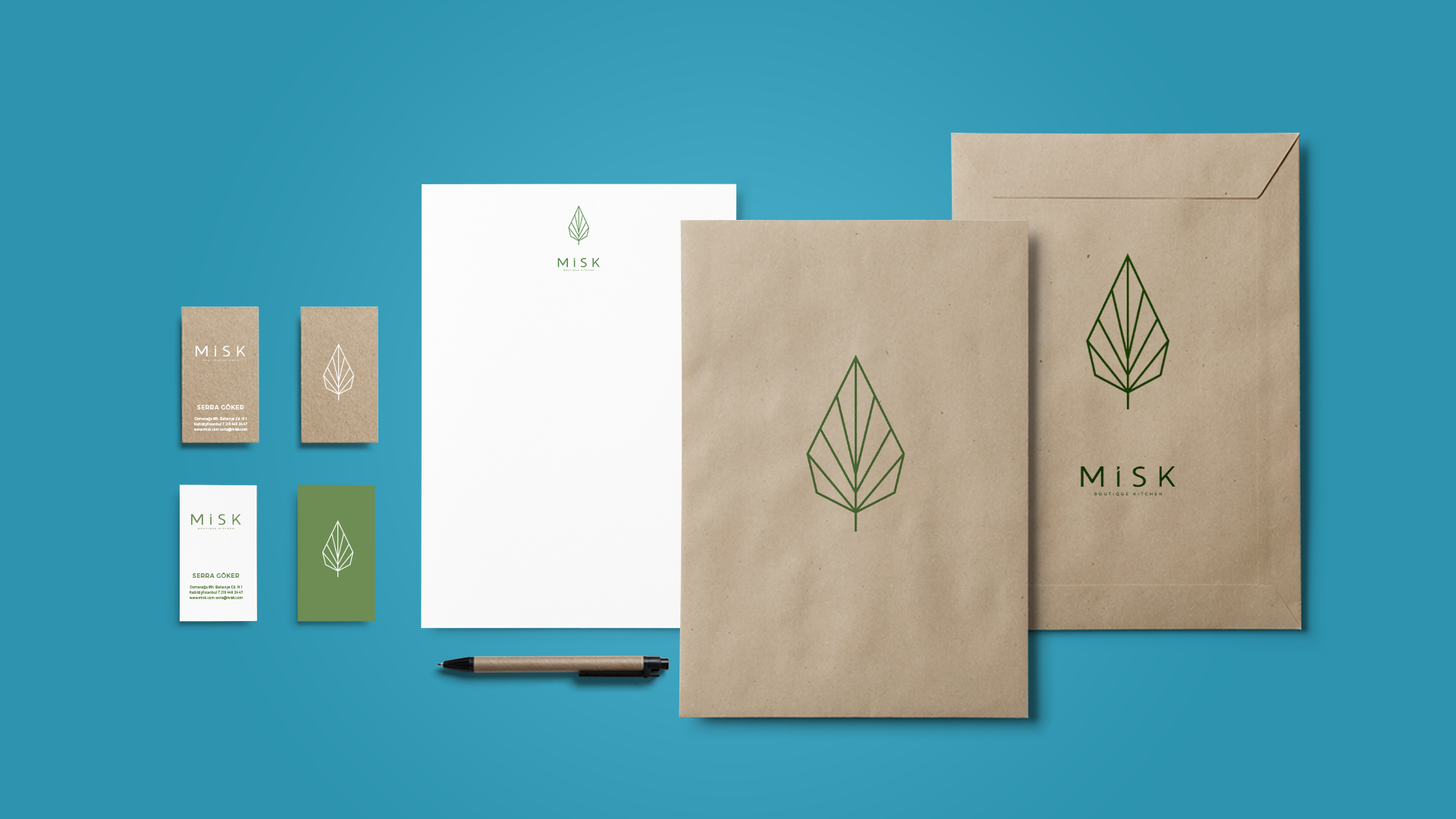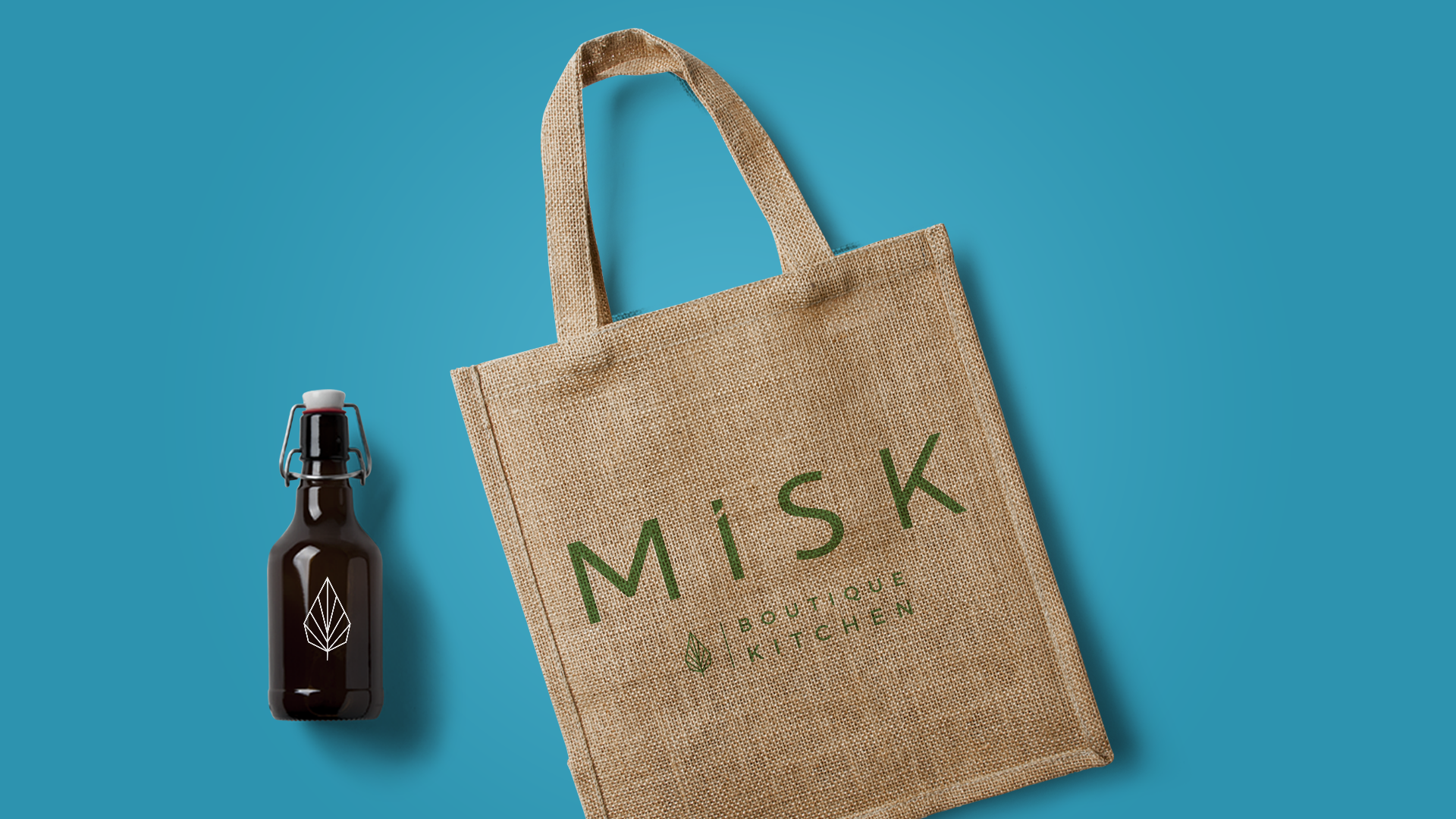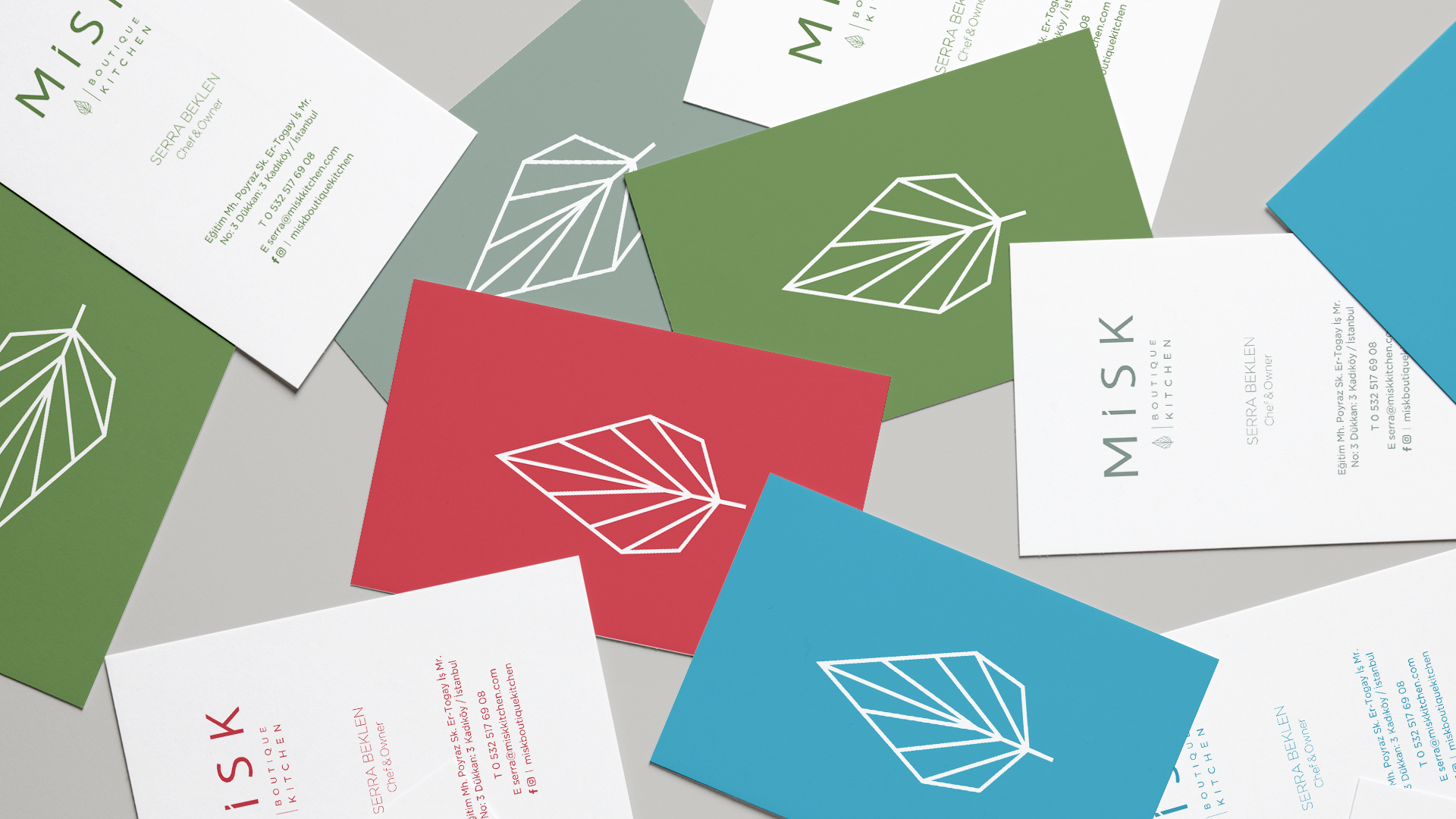
BRAND IDENTITY
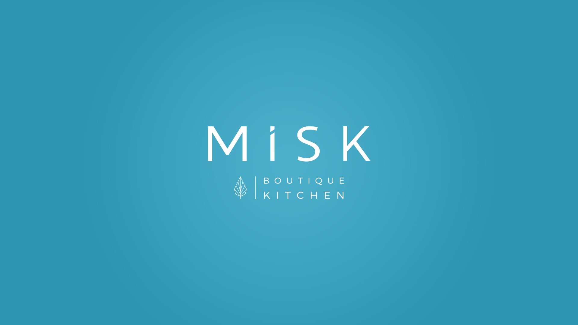
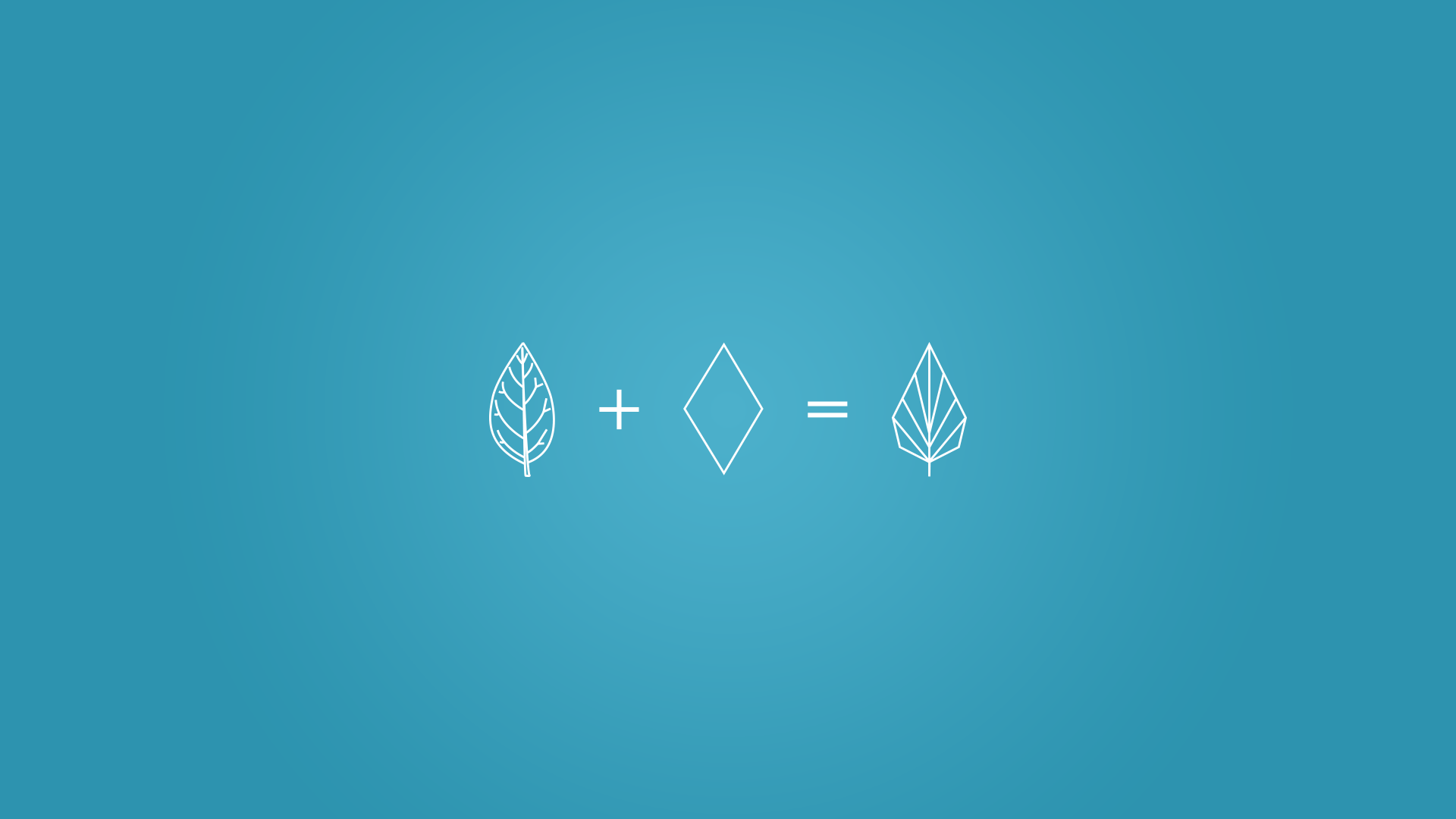
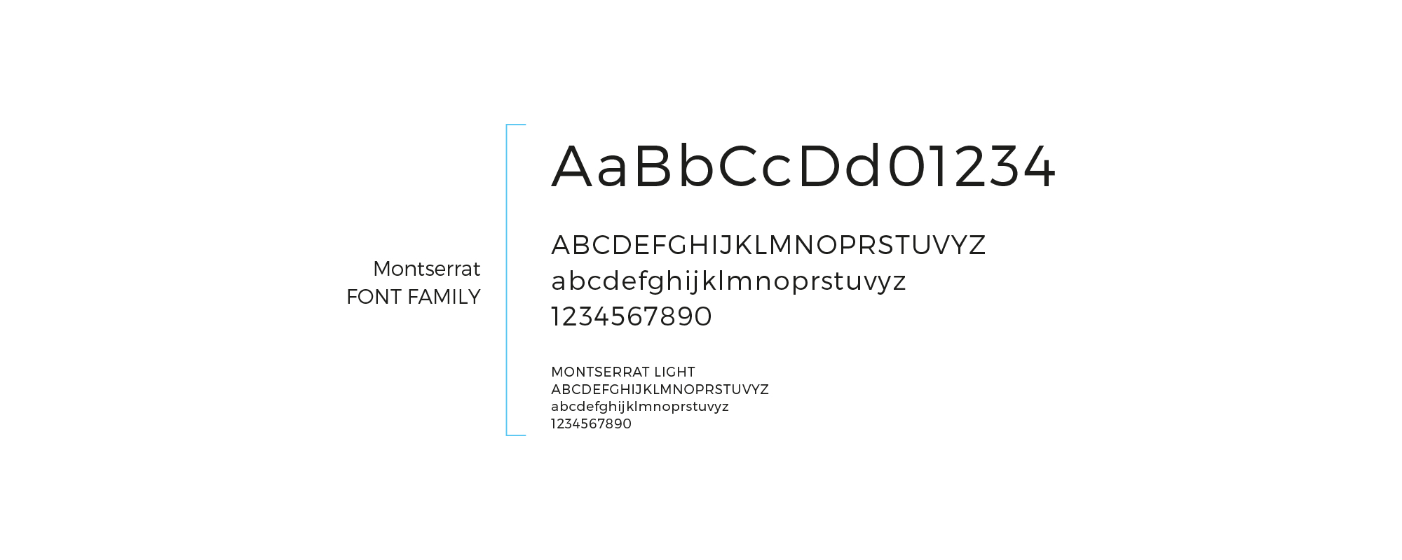
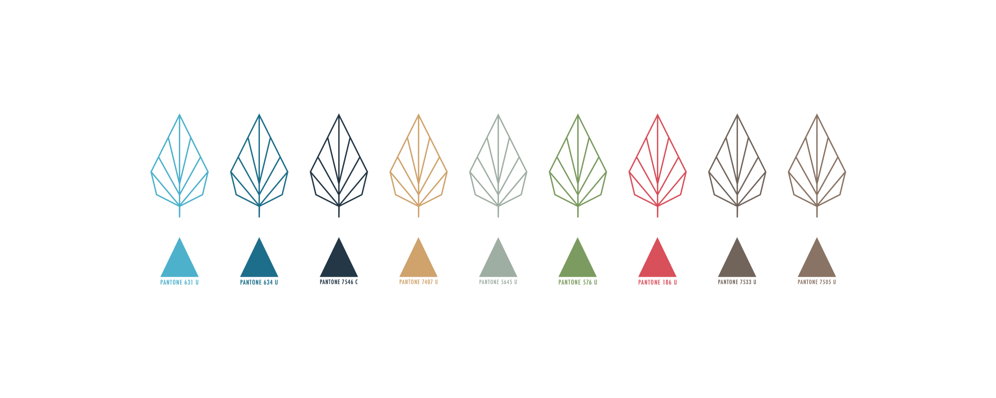
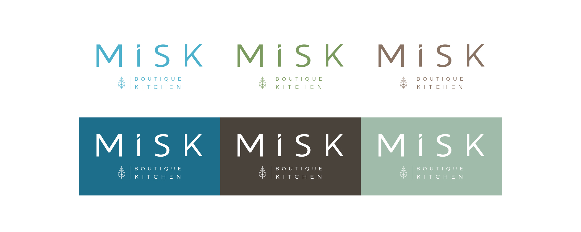
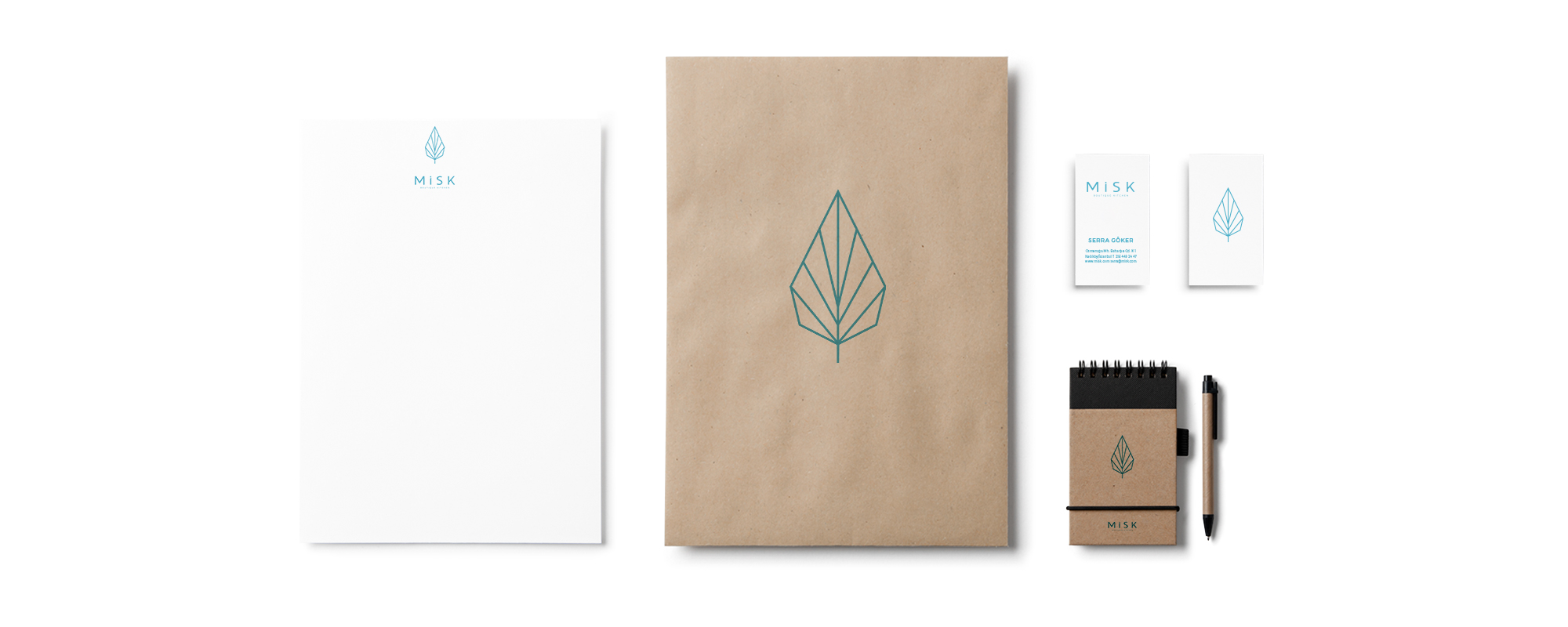
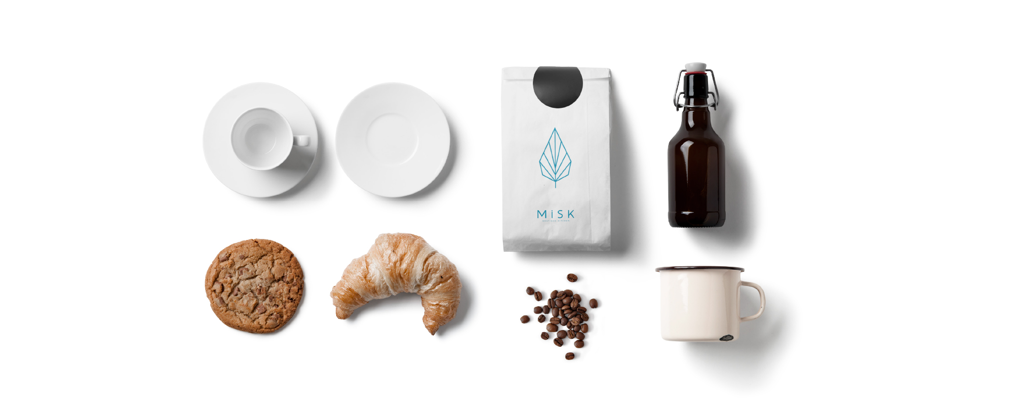
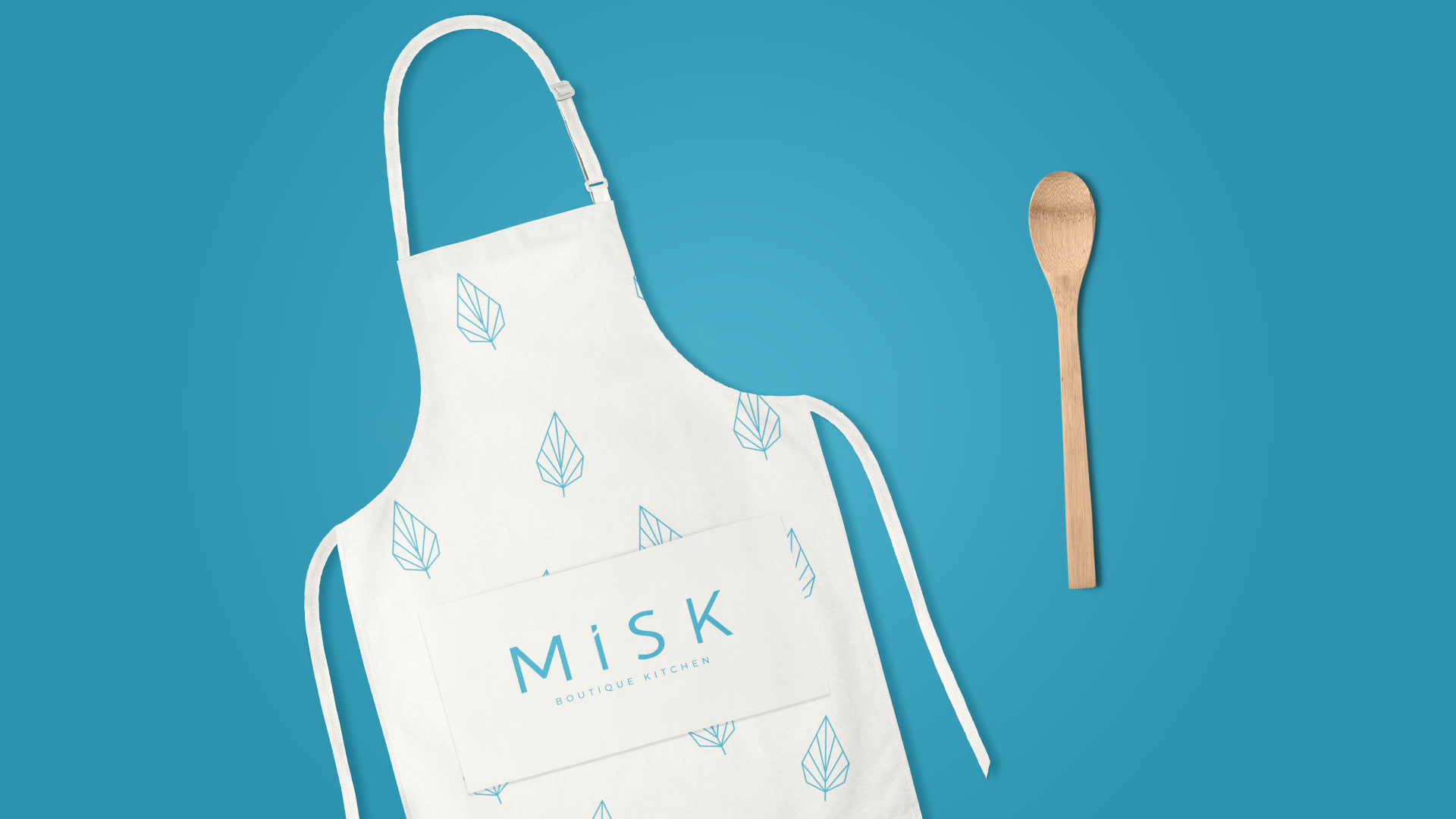
An entrepreneur opened up a boutique kitchen that caters only freshly cooked meals. For us, it felt natural to apply a modern and organic approach to the high quality catering brand. The inviting smell of cooking gave us the idea to construct the brand logo and we started off with the brand name meaning fragrance. To reflect the unpretentious manner of Misk, we created a colour palette of natural colours alongside a geometric leaf shape. The result is a simple design that celebrates the kitchen’s fantastic food. All branding items are presented in a unique way by our stylish use of line and typography.